…or, as the subtitle of this post should be, “a justifiable but completely unnecessary disappointment”. But hey, let me explain.
I have written often about photography these days being almost irrevocably ruined by truly atrocious post-processing leading to digital creations (rather than photographs) bearing little to no resemblance to reality. The reasons behind this are many and varied:
lack of technique on behalf of the photographer (and this includes everything from timing, framing, lighting and much more)
inexperience
lack of vision (thereby creating the need for serious digital alterations to make an image even remotely worthy)
basic laziness (fixing it in post is easier for the photographer who either does not know or cannot be bothered to get it right in camera)
failure (picture was a failure when captured and post-processing come to the “rescue”, such as it is)
but ultimately they call come down to the same thing: photographers rely so much on their “digital friend”. Rather than invest their time, money and effort into learning - no, into understanding - how light actually behaves and how technology works with it, they expect (or assume) that most “crimes” can be somehow fixed later. Examples?
I was quite shocked to find out, the other day, that a “professional” photographer did not understand basic physics - that the link between light and colour vibrancy and saturation was simply not even considered
I had a rather intense discussion with another “award winning” photographer who simply refused to accept that light falloff, in this solar system and subject to our laws of physics, does not happen within 5cm, even if the subject is standing in front of a mine entrance.
camera metering modes must be considered magic or alchemy or something. It’s the only reason I can think that some photographers simply cannot understand how they work - it’s not that hard.
But you don’t have to get technical really - one of the reason most photographers resort to massive image manipulation these days is because they simply do not understand the fundamental triangle between light, technique and subject. It’s the only explanation. (and by the way, I am not talking about rule of thirds, not about the exposure triangle or anything - just the fundamentals of how elements within a frame influence and work off each other!)
Whenever I have discussions or give talks about the above, I like to illustrate my point by using images from photographers I admire and for who I know their post-processing approach, philosophy, methodology and sometimes even technique. Most of the time, I like to claim that I can tell when an image is more digital art than actual photography, but as I recently found out, this is not always as foolproof as I thought it was. One thing I can say for sure that because I spend a LOT of time experimenting, studying and analysing and am extremely detail-oriented, I have developed an eye for this and, until recently, had a near perfect record. But, before I go into the specifics of today’s post, let me clarify a couple of things - to avoid a flame war more than anything:
photography actually means something - yes, it’s an art/calling/whatever, but as a word and concept, it means something. For those who may not know it, it is a greek word which means “writing with light”. It was created to describe something very simple (and yes, it is simple): the play between light and shadow and, later on, the range of hues and colours. When photography was invented, the concept of radically changing the content of an image, of fundamentally altering the light to something completely different, of removing or adding elements was never considered, not because the technology was not there, but because it would not be “photography”. You would no longer be writing with light - you’d be doing something completely different. And this is a historic fact.
naturally, the world changes, evolves - sometimes for the better and sometimes for the worse. Evolution gave us new tools with which we can paint with light - all of a sudden lighting shadows or darkening highlights was possible, either chemically or literally physically (by actually putting cardboard between negative and film!), enhancing contrast was possible, sharpening became a tool at our disposal. The memories of our visual world expanded and we could start documenting it as our eyes were experiencing it. But even as we experimented, pushed our boundaries and expanded our world, we still, essentially, painted with light.
and then digital came along and, lets face it, everyone was seduced. Who can forget the infamous first National Geographic cover using the first Scitex machines? When all of a sudden the Giza pyramids were taller and closer together? Tens of thousands of people saw the cover and were transported to a magical world which however, did not exist. NG apologised profusely, but the damage to its reputation was, back then, immense. Traditional, working photographers, seduced by the capabilities of the new technology jumped on the bandwagon and for more than two decades produced a range of images from the subtle to the absolutely surreal and fake thinking that THIS was the missing tool in their arsenal as they attempted to tell their stories. However they, inadvertently, changed the world forever. For travel photography this became a plague - tribal portraits were massively embellished, places were magically transported 100 years back with the removal of modern elements, cultures were presented as the photographer thought they were, idealising them, rather as how they really were. in other words, we stopped painting with light and we started painting with pixels and our imagination. Good? Bad? We’ll see…
And finally we come to today: technology has become much more advanced, cameras have become infinitely better, resulting in more flexible and versatile raw material (pun intended) but unfortunately the same cannot be said about photographers - we went completely off the reservation. We jumped the fence between photography and digital art so much and so frequently the fence became almost inconsequential. Unfortunately, for travel and reportage photography this is bad - very.
As with a lot of things in life, “ease” resulted in cutting corners, ignorance of fundamental techniques, pride and, as a direct result, lies and pretence. “Photographers” these days create interesting, engaging and often beautiful digital paintings but unfortunately choose to present and share them as “photographs”, frequently lying about the process that went into creating them as if it’s something to be ashamed of. I get it, I really, really do: how can you claim you’re a “master photographer” when 90% of what you share with the world is not, actually and factually speaking, “photographs”? So, you make up for the lack of maturity and depth, knowledge, experience and technique by resorting to technology. You reach for not actual photographic effort, but a mouse and thousands of Youtube videos to teach you how to manipulate an image to change the light, alter the depth of field and much, much more. It’s easier, cheaper and hey, all of a sudden tons of crapy images from your library can be resurrected into something else - possibly even what you had in mind in the first place but the lack of all of the above simply prevented you from getting.
“And in this, you are lucky - extremely lucky. You live in a world where it’s easy to fake it. That’s okay - admit it, nobody will think less of you if the result, if your artwork is beautiful. Yes, you may not be able to claim you’re the same as Steve McCurry, but why should that matter? Why should that turn you into a liar? Do you rather be a fake than a talented digital artist?”
So, now onto why I’m feeling like a dunce. Over the course of the past 20-odd years I’ve been looking at images, slowly and carefully gathering the ones which inspire and challenge me (I think I have around 10,000 in digital format and more than 120 books with hundreds of page markers and notes), studying them for hours at a time, learning from them, trying to understand how they were shot, where the light was and how it was setup and much more. Sometimes my forensic analysis results in notes, lighting diagrams, post-processing notes and much more. Sometimes I even take inspiration from them in crafting my images where I put my analysis to practice and validation. Unfortunately that also means that when, sometimes 5-6 or even more years later information about those images comes up which refutes my analysis, my belief in my so-called skill is pretty much shattered. Example?

Let’s take this absolutely awesome image of the cowboy - one I would love to have taken. It’s pretty straight forward to take: there’s a strobe through some modifier camera left (which one does not make much difference, but it must be small - based on the falloff) at about the height of the subject and, either HSS or a VND to cut down the ambient (there is, of course, a possibility it was taken with this light - again, small difference). In terms of post, again, nothing terribly complicated: obviously saturation has been increased along with clarity (but not overtly so), there’s some adjustments in the shadows and highlights - maybe a couple of other things. All in all, an image to aspire to. In fact, if you look at it a certain way, I’ve shot images like this. I have been in awe of this image since I first saw it many, many years ago.
And then, a few weeks ago, at a fellow photographer’s place, I saw the video this photographer released about how he made the image. Smack! In less than 10’ I felt absolutely dejected. First of all, yes, the base image is there, exactly how I had analysed it - in fact, I had gotten the lighting and placements 100% right. But that was it. Everything else turned out to be fake:
the sky? no, not real, replaced. By the way, the original sky would have worked fantastically well if the image was naturally shot with a graduated ND filter! It was that good!
the background? that was real, BUT neither the tonality not the bokeh was real. This was simulated. Why? Probably because in order to manage the light, the photographer had to stop down his lens quite a bit, resulting in a much larger depth of field, forcing him to adjust in post.
the lighting? more than 1/3 artificially added. Why? multiple reasons: insufficient power when shooting - could be, has happened to me. wrong settings - possibly, but the question is why? An accident or miscalculation OR the safety that this could be fixed in post?
And all that took about 30 hrs in post, I think it mentioned 40+ layers in Photoshop, advanced blurring techniques, add-ons and much more. For something which could have been done in camera. Every single artificially added or changed element literally need not have been done! None. Every single element could have been done right in camera! Every. Single. One. Just consider that for a moment. An amazing image, without a doubt - I love every single aspect of it and now that I know approximately 1/2 of it is fake, I still love it. I would hang it in my house without a second thought. But when this image was initially shared, it was shared as “let me show you how to create amazing images right in camera” and “take your lights outside and create incredible images quickly and easily”. It was not: “let me show you how to create amazing images using your camera and photoshop”.
Should any one think less of this artist? Absolutely not and if they did they would be simply and pointlessly mean (Oh and for reference, I consider this photographer both extremely talented and technically competent! So, don’t even go there - this is not about him, he did not do anything wrong. This is about me…). The concept is great, execution (from capture to post) excellent. But, going back to my main point, this is not a photograph. It’s an amazing digital creation and the artist has every reason to be proud of it - I know I would be. However - and herein lies the difference between photography and digital art, I would have attempted to get everything right in camera. Yes, I would have probably still needed to make minor contrast and sharpness adjustments, but I would not replace the sky, fake the depth of field, add more light after the fact. Did all those things make it a better image that the one captured? Absolutely - they made it a better “image”, not a better “photograph”.
Contrast it with the work below - another known artist and I’m using a picture I know very well, both the before and the after.

The light (the strobe) here a much more subtle (but that’s a matter of preference anyway), but every single other thing is real. There is no sky replacement. The light was not added in post and the depth of field is what it was during capture. Fog/mist? Real. Yes, the image is slightly - very slightly - desaturated but ultimately it did not need to be much because the image was shot using a ND filter so that piece of glass took care of most of the colour anyway. The image is also colour toned to the greens and blues (which by the way is something which should always be considered when shooting black skin) but wanna know something? Film photographers would do blue toning through drops of selenium in the fixer, so there’s nothing 2022 about this concept. So, this is a photograph, not a digital image.
Now, both images are fantastic - I have drooled over them both for years and have sought to emulate them, their artistry, technical approach (at least the one I thought I had reverse-engineered) and overall result. And yet… lets look at the other examples below:

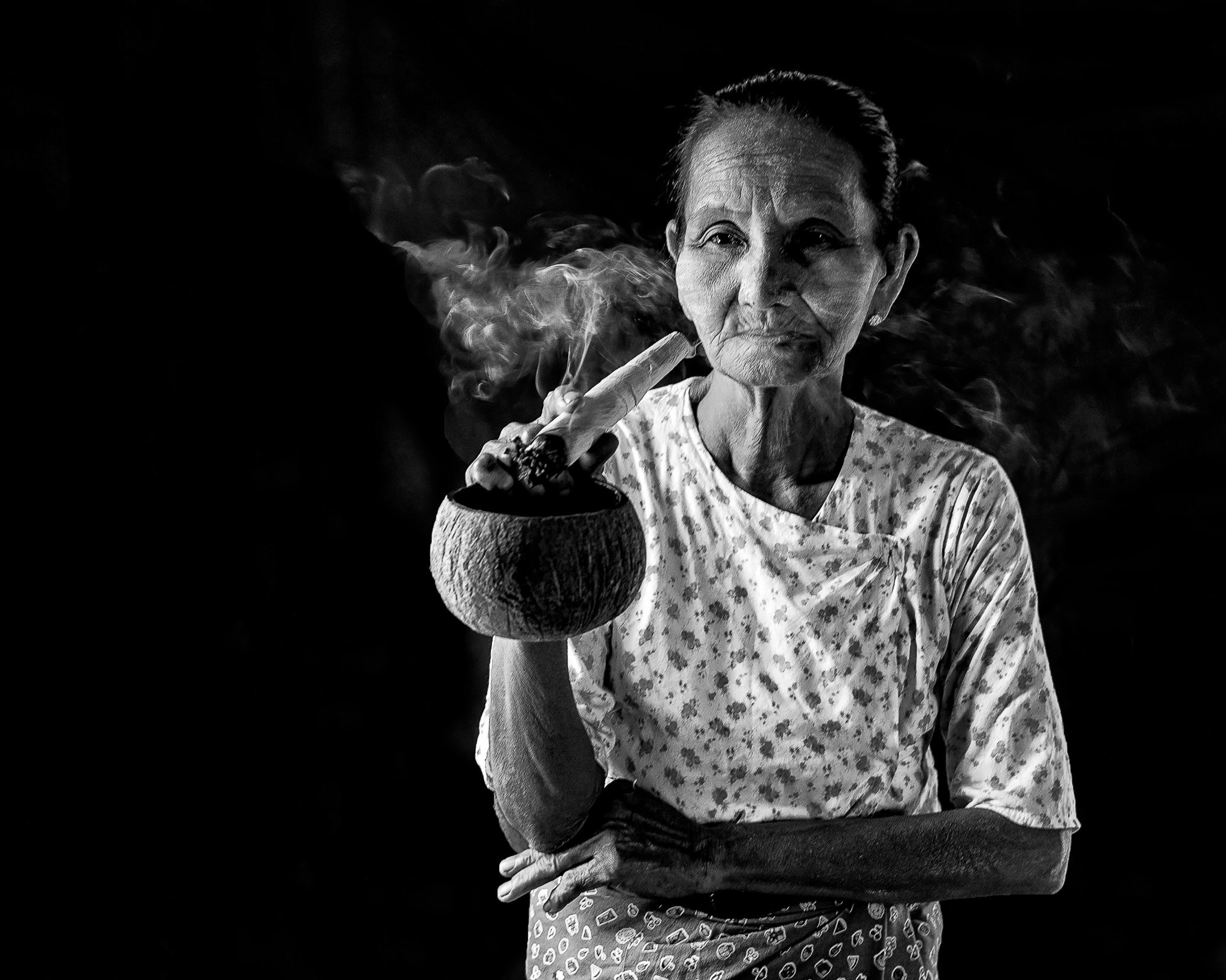
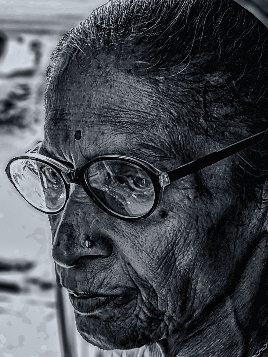
Fake darkness. Why? well, the image was shot on location under the full sun (you can tell by the direction of light) and the photographer simply did not bother with managing the light then. There was also some background s/he didn’t like and decided to take out the digital paintbrush and “do away with it”. How do I know? Surprisingly enough, physics. In our solar system, light simply does not behave this way - it does not fade away into absolute darkness when the subject is blasted with midday sun.

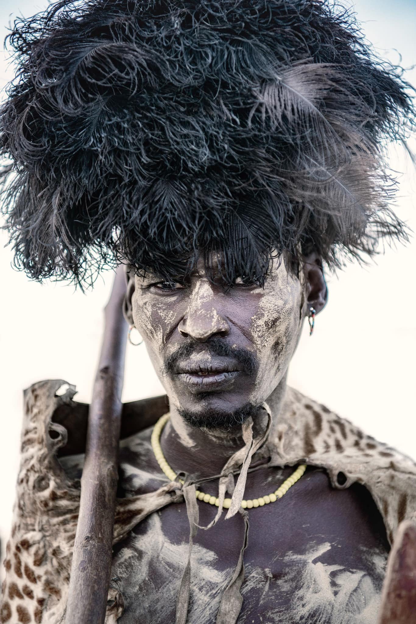
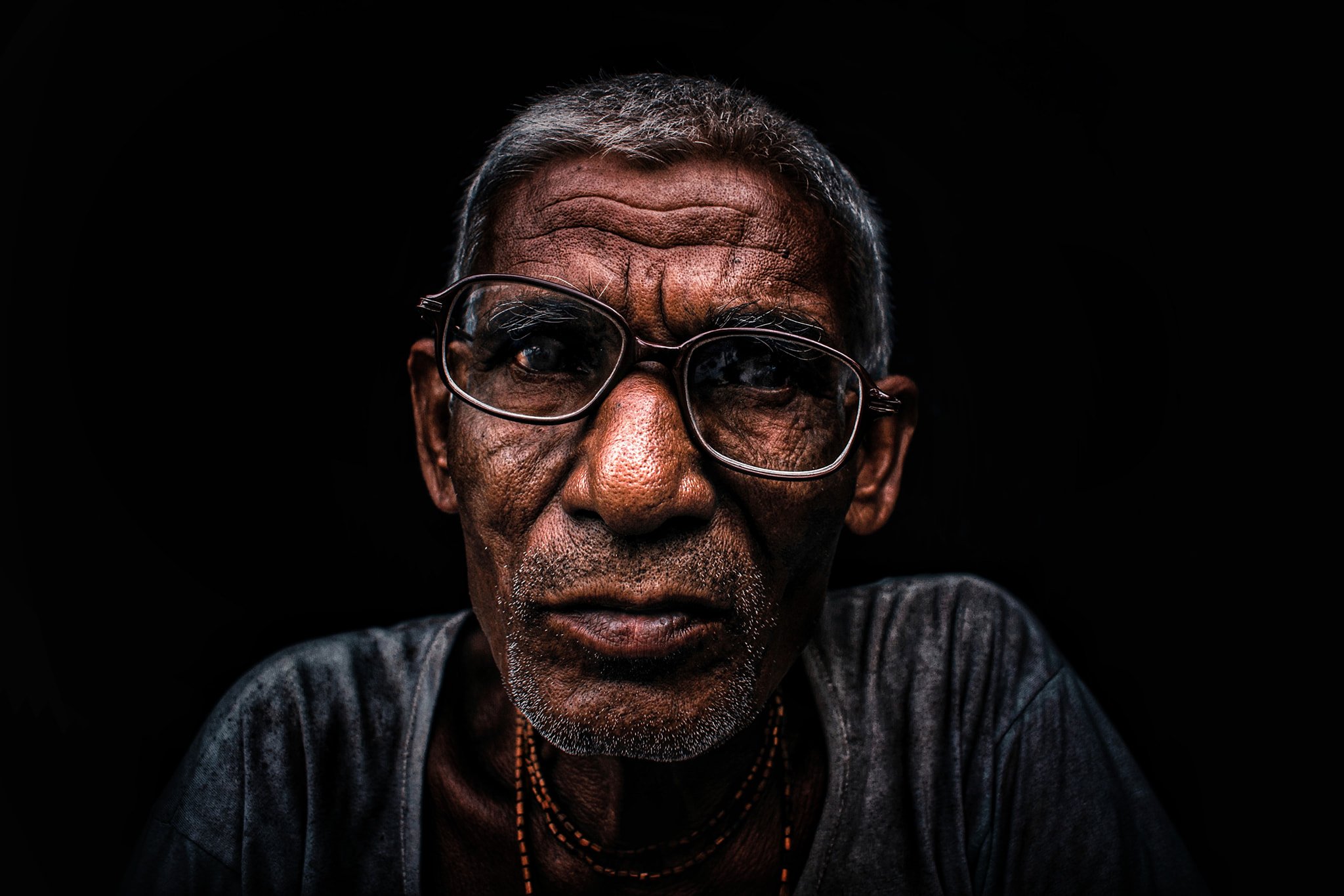
Angelic light. That’s the opposite of the previous image. A magical, high-key image of total, blinding light. Taken, one can surmise, on a planet where the light is pure white and available everywhere - front and back. Where people float but in their eyes the ground is reflected (maybe they’re standing on a cliff? Facing heaven or something? I’d love to visit this planet where background light does not spill into the front and is not reflected on what the subject sees - would make for some really psychedelic shots. Of course, I’d need to take my f/-0.5 lens with me

The mysterious bokeh. How is that when you actually take a picture at, say, f/1.4 you can see the bokeh actually increasing as you move away from the subject? The answer is actually quite simple: optics. It’s the same in the hundreds of millions of lenses in circulation. Not however in this one - this is special. Here bokeh is constant. Cool ey? Impossible, but cool - I particularly love the edge along the right of the subject where the artificial blur is so obvious it looks like an invisible barrier. Let’s call this the “digital bokeh” and move on, ey?

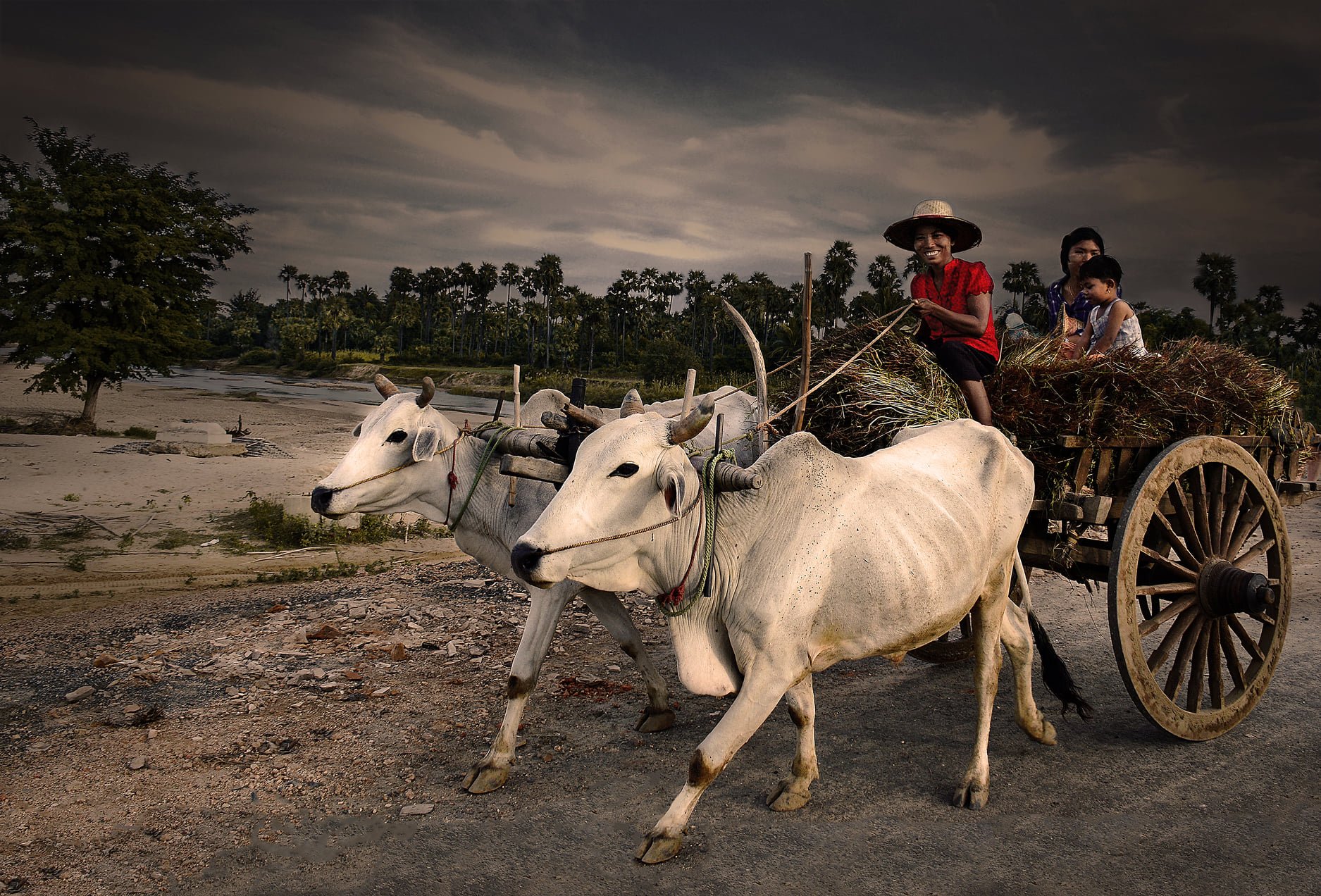
The “teleportation is real” image. Some would even dare to call it “the really bad composite”, but dare to even suggest it to the photographer and instantly you get attacked as “putting the artist down” and “lying about the image”. Of course, you don’t really need to be an expert to see that there is no way the subject could ever be inside the location - the light is different (both in terms of direction as well as power and quality), the resolution between the two images is different. It’s not a bad image per se (I don’t personally like it, but around 20 more people did when this was posted by the “Visual Storyteller/Photojournalist” on social media)
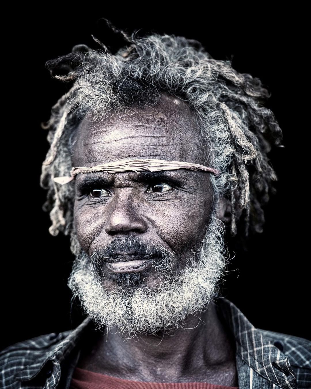
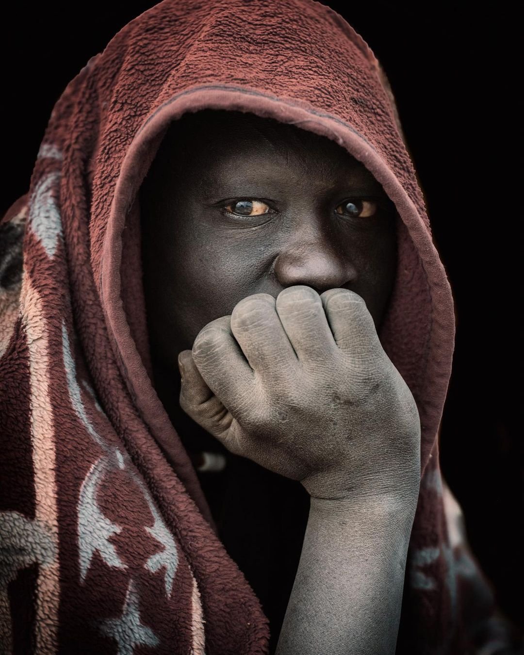
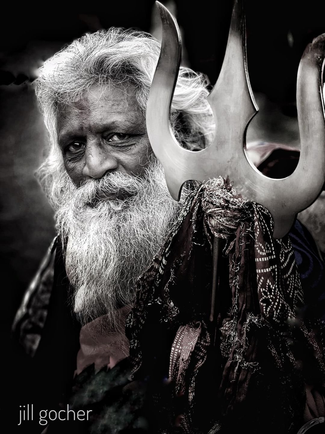
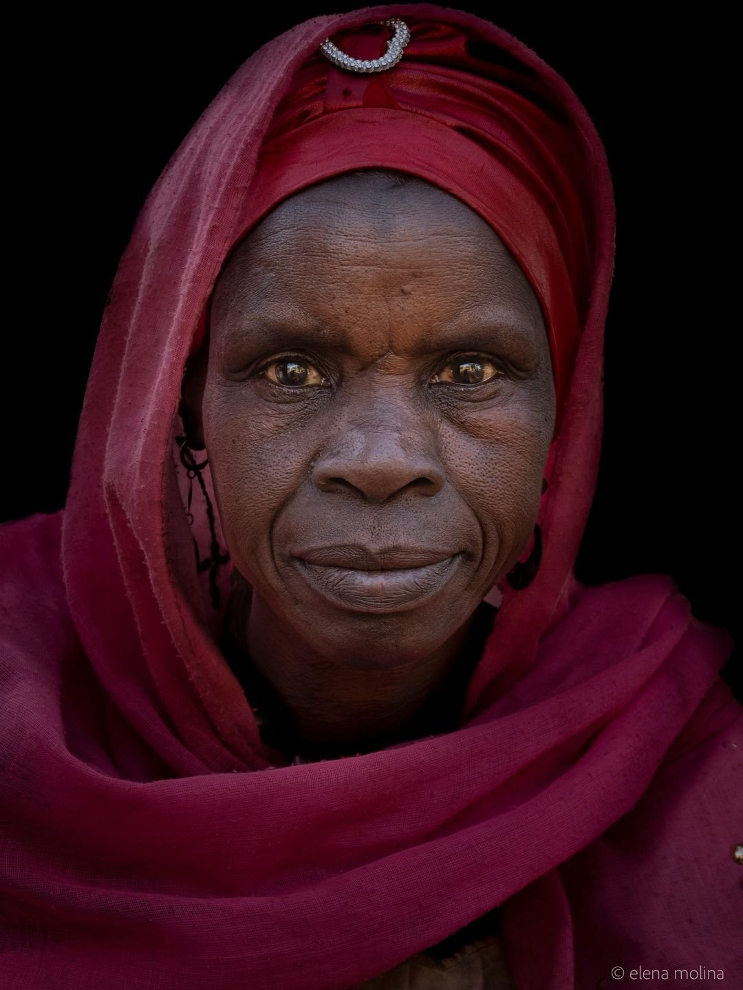
Now, with the exception of the first and last images, the other images are really beautiful - they are not real representations of either the subjects or their locations (by the way, notice something? there’s no context here - no location - just a face), but as digital art, I’m sure millions of people would love having them hanging on their walls. After all, art does not need to be real, right?
All I’m trying to say here is simple: want to take a mediocre, mostly uninteresting and/or uninspiring picture and turn it into something amazing through 100+ hours in post? Awesome! Kudos to you and it shows skill and technique (well, maybe except the final example, but you get the idea)! The skill and technique of a digital artist, not a photographer. And as a digital artist you should be immensely proud of your work and your images - just don’t call yourself a photographer, visual storyteller, photojournalist or documentary photographer because, honestly, you are not. And that is perfectly okay. It really, really is. You know what is not okay? Passing image like the ones below as photographs:
And just to show you how OK it is, even the legend that is Steve McCurry who, I think we can all agree, has both the experience, the technique, the skill, the vision and the style, even he has used photoshop extensively to change his images and, following the revelations came out to say he no longer considers himself a photojournalist but more a visual artist (his words, not mine). And honestly, I don’t think he actually needed to - he has such a massive volume of work that his legacy is safe, but he chose honesty and truth to the spirit of what is photography. Maybe it’s time the rest of us do too.
I’ll leave you with a food for thought: it’s okay to try and fail. It really, really, really is. Every single photographer in the world has failed - thousands of times. I think Michael Jordan said it best:
“I’ve missed more than 9,000 shots in my career. I’ve lost almost 300 games. Twenty-six times I’ve been trusted to take the game-winning shot and missed. I’ve failed over and over and over again in my life. And that is why I succeed.”